Data Visualization of the Period Table
I’m always on the hunt for meaningful visualizations that tell a story. Unsurprisingly, stories of ‘conflict’ always end up being the most interesting — not conflict of people, but of ideas. When you can see a certain wrestling with the data, a back-and-forth attempt to understand how the pieces fit together; how to communicate the ideas and the underlying structure of a system.
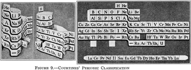
I stumbled upon an excellent example of this in the evolution of the Periodic Table and how it’s been visualized historically up to present day.

If you’re like me, then you’ve only really been familiar with the standard diagram we’ve all seemed to learn (or try not to learn) in high school chemistry classes.
But flipping backwards through the years, it reveals an incredible story about the impermanence and the…well the mutability of the whole thing.

It’s not simply a description of reality as it is and how it’s always been, but it’s a real attempt to both describe the physical world around us as we understand it and then to put it into an explanatory framework for all sorts of phenomena.

There’s obviously a lot going on — certain elements belie certain shared characteristics, others quite different, and based on our understanding of what’s really going — at least as far as we’re able to observe.
