COVID-19 Data Visualizations - Data, Infographics, Dashboards, and Models
Originally published on Abt Associates’ Insights Blog
Every time I try to embark on typical work-work right now, I hear the old joke echoing in my head, “…other than that, Mrs. Lincoln, how was the play?”
One of the helpful ways I’ve found to cope is to try and understand --- to unpack the data and see what’s happening, and to see a light at the end of the tunnel. Helpfully, my colleagues here at Abt are of a similar mind, and we’ve been passing around links, models, datasets, and infographs.
This week has seen a flurry of nascent discussions about data, data visualization, and the various models that are being looked at to address COVID-19. We wanted to highlight just a few (this is far from exhaustive) that have come across our attention at Abt Associates as we work to coordinate responses with our various partners, clients, and the .
Important note: There are careful about sites you visit and prompts to “download additional software.” And as a disclaimer, in addition to some of the most fantastic and up-to-date data reporting I’ve seen in my lifetime, there is a lot of misinformation out there as well. Some great places to inoculate yourself and others against misinformation are this Wikipedia page devoted exclusively to misinformation, the Snopes coronavirus page, and the FactCheck.org page as well.
Data
-
Semantic Scholar - CORD-19 — The COVID-19 Open Research Dataset (CORD) is one of the most interesting datasets on this I’ve seen. AllenAI teamed up with research groups to compile nearly 30,000 scholarly articles (13,000 full text) related to COVID-19 and the coronavirus family of viruses. There are some great links on the page to further details about the origins of the journal articles and the like, as well as some of the partners that are contributing, including the White House, the Chan Zuckerberg Initiative, Georgetown University’s Center for Security and Emerging Technology, Microsoft Research, and the National Library of Medicineof the National Institutes of Health.
-
Kaggle — COVID-19 Open Research Dataset Challenge --- Framed as a call-to-action on the -19 dataset, Kaggle (online community of data scientists and machine learning practitioners) is looking to data scientists and AI/ML experts to “develop text and data mining tools that can help the medical community develop answers to high-priority scientific questions.” Awards are separated into tasks, which can net up to $1,000 per task (either as payment or donation to relief efforts). Very cool. Pro tip: Check out this Reddit thread on the Machine Learning sub-reddit for pointers on this specific challenge.
Data Streams
-
WHO - Situation reports --- Daily reports on the pandemic, in PDF form (confirmed cases, deaths, etc.).
-
UN WFP - COVID Travel Restrictions --- Global map and dashboard of updated travel restrictions.
-
CDC - Public Health Media Library - 2019 Novel Coronavirus --- Link to CDC’s RSS feed on Coronavirus (you don’t need a special reader for this — it’s just updated info as they come out on the What’s New page.
Infographics
-
InformationIsBeautiful - COVID-19 Infographic Data Pack --- Very sensible and clean data from David McCandless, Stephanie Starling, and Omid Kashan or InformationIsBeautiful. Great updates (with change log — perfect), and sourced from Johns Hopkins University, Centers for Disease Control, World Health Organization, Statista, China Center for Disease Control & Prevention, Google News, New York Times, The Guardian.
-
Our World in Data - Coronavirus Disease (COVID-19) — Statistics and Research --- This page is an incredible resource not only because of the tremendous amount of data displayed and conveyed effectively, but because of the very deliberate effort put into contextualizing the information, the limits of the data, and the underlying subject matter in general. Terrific.
-
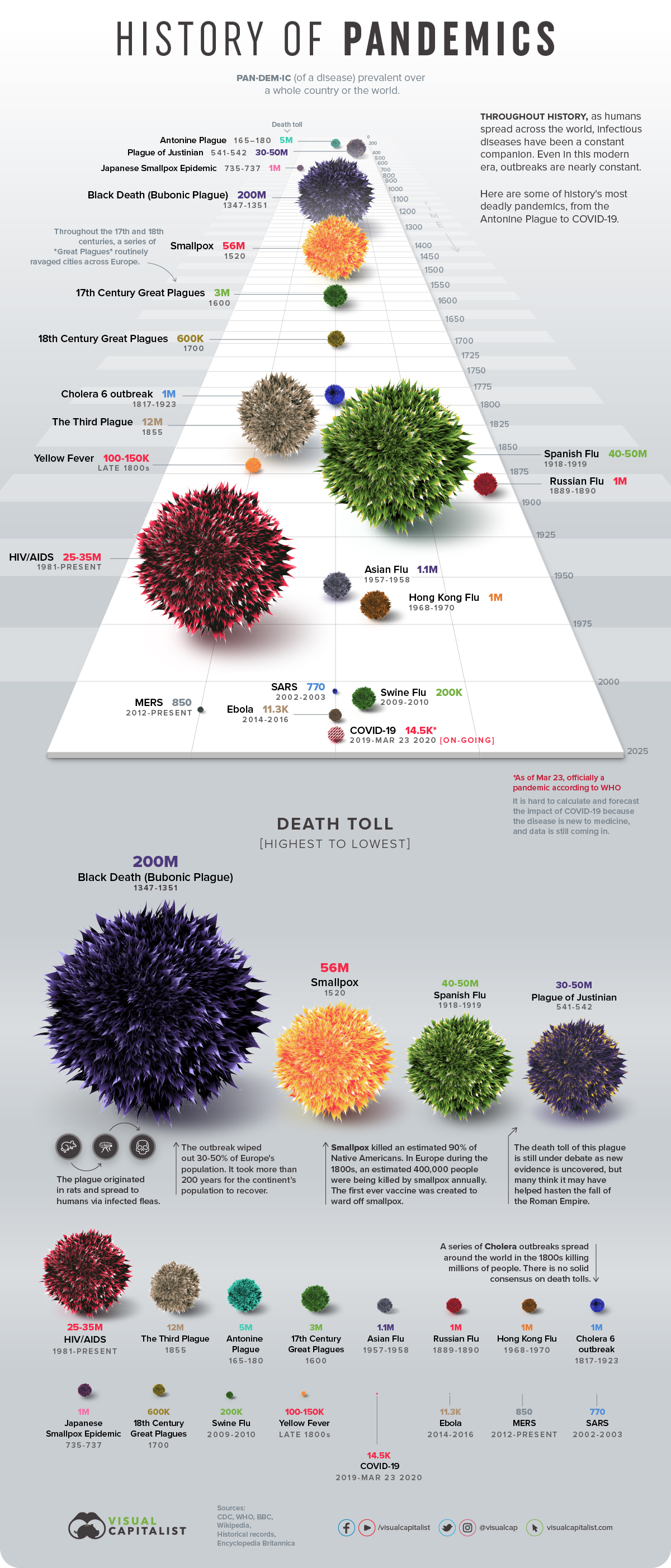
Infographic: The History of Pandemics, by Death Toll --- This infographic (just a snippet below) has some really great information in a very original display style that conveys time, size of pandemic, context quite well.
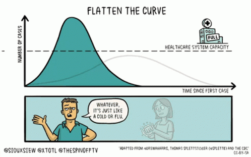
Flattening the Curve
This section needs its own newsletter. This term has entered the lexicon faster than anything I’ve ever seen. And it’s maybe one of the best examples I’ve seen of data visualization in action to change behavior. There have been so many recent variations. There’s even a write-up about the history of the chart itself.
What’s been incredible to see is the various creative commons and sharing folks are putting on their products. It’s about getting the word out.
-
New York Times Opinion - How Much Worse the Coronavirus Could Get, in Charts
-
Washington Post - Why outbreaks like coronavirus spread exponentially, and how to “flatten the curve” --- The simulations in this article are fantastic.
Dashboards
-
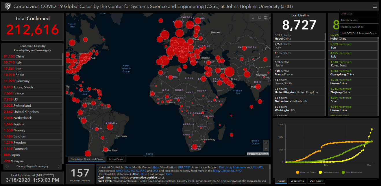
Johns Hopkins - Coronavirus COVID-19 (2019-nCoV) --- Maybe the most well-known dashboard of COVID-19 floating around right now, built on ArcGIS. From Johns Hopkins University, specifically assembled by the Center for Systems Science and Engineering. More background on the visualization on their blog, as well as a link to their GitHub repository with all the various sources of data. According to their FAQ, the website is currently getting around 1.2 billion data requests per day.
-
WHO - nCoV 2019 situation (public) --- The WHO dashboard, similar to the Johns Hopkins example (the JHU dashboard includes the WHO data as well).
-
Tableau - Global Dashboard --- Tableau has its own Tableau Public dashboard as well, with solid background and data sources to go along with it. They’ve also got links to Tableau’s global community visualizations from experts like CNBC Digital, Kaiser Family Foundation, and more.
There’s a lot going into all of this — and not everything that will have been created will take in the best data, with the most concern for the nuances of the data itself, or even communicating the right takeaway in the first place. If you’re considering making your own visualization, read this article about some considerations to first think of. Also, this review of dashboards has some really solid links and points in it.
Models
-
Modeling COVID-19 Spread vs Healthcare Capacity --- This interactive model of healthcare capacity (made with R Shiny, GitHub here) is quite good (and quite unsettling). Really allows you to demonstrate the “flattening the curve” in simulation form and see the resulting effect.
-
Observable - Quarantine Now --- This page and set of related visualizations is incredible not only for its visual display and interactivity, but because it’s also built in Observable, which leverages Jupyter-like notebooks for exploring data and code in real-time.
-
When does Hospital Capacity Get Overwhelmed in USA? Germany? --- Not an interactive model per se, but a very helpful article walking through various scenarios and assumptions. Great primer if you’re trying to understand what goes into a “model” like this in the first place. Plus there is a Google Sheet with the modeling data itself in all its raw form.
Other
- WeMakeChange - Coronavirus Tech Handbook --- The folks at WeMakeChange have begun compiling a “resource for technologists building things related to the coronavirus outbreak.” It’s written in Google Docs (which seems to be limiting certain sections of contributions due to heavy traffic) with all sorts of good pointers to response, tracking, adapting, medicine & care, public knowledge, community resilience, and even engineering. There are some REALLY solid links in here — and a bunch of folks keep contributing new/specific information. I highly recommend.
Thanks to everyone at Abt who shared links and updates for this post!