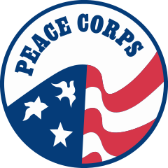
The Peace Corps Logo
One of my topics over the couple years that I’ve been at Peace Corps is to look at various entities of the logo of Peace Corps. I’ve had a hand in creating a couple of inter-office branding campaigns, while updating others—so I love looking at the various ways the logo of Peace Corps has changed over the years.
History of the official logo
A lot of folks assume that the current flag-dove logo has been a part of Peace Corps since the beginning.
I haven’t dug too deeply into this (I’d love to learn more and update it here!), but researched it a bit over the years.
Fun fact: when I was looking at the history of the Peace Corps page on Wikipedia, the very first commit was in 2002 and said simply:
“The United States Peace Corps was established under President John Kennedy in 1961. In brief, U.S. volunteers work in third world countries, sharing standard of living of natives, and hoping to educate them and bring appropriate technology.”
How times have changed.
The Stamp Era
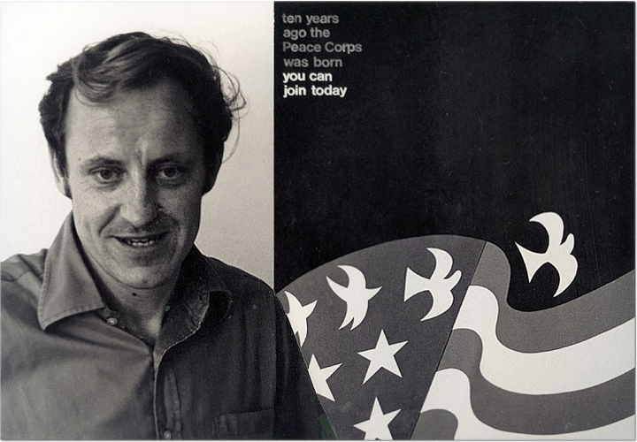
What we today recognize as the iconic logo of Peace Corps didn’t actually come to exist until 1971, when there was an open call for submissions for a “Peace Corps Stamp” contest — in which David Battle submitted this poster:
He won runner-up but his design stayed in the minds of Peace Corps officials in Washington.
In 1972, a commemorative stamp was to be issued for Peace Corps, and a modified version of his poster was being used for the design.
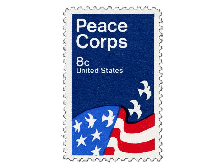
Then in the 1970s, the “Go in Peace” poster refined and solidified the design even further.
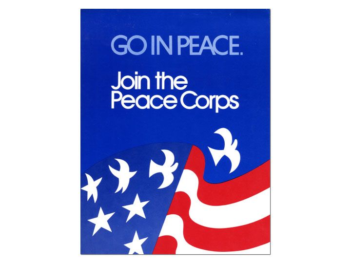
My favorite part of this story is that Battle himself was never notified about the use of his design as the logo, and found out only when his neighbors were having background checks done on them prior to his invitation to Washington for the stamp’s unveiling. The story is well-chronicled at the Yellow Spring News article. Oops.
The early days of Peace Corps branding
Interestingly, there wasn’t really an official logo or seal in the early years of Peace Corps (that I could find). If you look at things like the Annual Reports to Congress1, you see that there is just bold text (not sure of the typeface) for about five years.
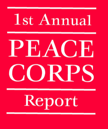
1965 saw a slight deviation though this is from a scanned PDF, so not sure of what more detail would illuminate on this version.

1967 saw this cool little ‘PC Circle’ with 13 stars (not sure why — original posts perhaps?)

1971 goes back to typography (fun fact: this year has a forward by Neil Armstrong!)
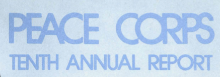
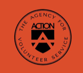
The late 70s and early 80s were interesting because Peace Corps was folded bureaucratically into ACTION — along with VISTA and some other agencies (Wikipedia link), so accordingly, any Peace Corps logo would have been down-played in favor of the ACTION logo.
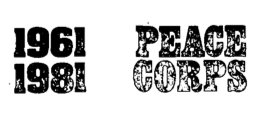
In 1982, Peace Corps became independent of ACTION, but the logo stayed as bold letters.
The Flag-Dove Era
Finally, in 1984 we see the recognizable circle with flag and doves with Peace Corps across the top—which has remained for the last 30 years—untouched and pristine.
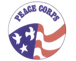
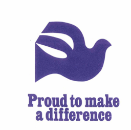
Ha ha — just kidding! We had the lonesome dove of 1987:
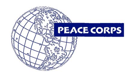
Then the ‘bumpy Earth’ logo of 1997…
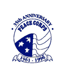
…though to be fair they also used this modified flag-dove logo to celebrate the 35th Anniversary of Peace Corps.
The next years were basically all variations on the flag-dove theme (though I swear it looks like it was re-drawn every single time for every year), until 2006 when the agency had the ‘patch’ logo debut for the 45th Anniversary.
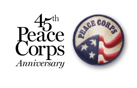
Since 2006, the agency has used either the Patch logo—for more public-facing and recruitment materials, or the simpler vector graphic—more for internal/official uses. Of course, there are official use guidelines for these logos as well:
And finally…as we enter a new era of creativity and align ourselves with the Maker movement, I couldn’t help but create the first Peace Corps Logo Token and throw it up on Thingiverse.

