Advanced Dashboards in Excel
Each unit within Peace Corps has been urged to come up with a ‘dashboard’ of performance metrics on a regular basis.
The thinking is that this would help both senior leaders to keep up with agency activities on a more regular basis, but also for the units themselves to monitor their activities and be able to gauge their performance and more importantly to ‘make data-driven decisions to modify our own actions towards better outcomes’.1
Over the last few months, I’ve been the point-person on our team to develop our dashboard, and to iterate onto a solution that makes sense for everyone.
It’s an ongoing process, but I thought I’d update with where we currently are, and why.
The approach
In chats with the folks in the office, we really wanted to do this right.
The nature of the work in the Office of Third Goal and Returned Volunteer Services (3GL) means that we actually have a fair amount of data and analytics of various programs that could be measured, monitored, and improved.
At a very high level, I used user-centric design in approaching this project. I really wanted the team to understand the iterative nature of this project, and I solicited their feedback often.
Defining ‘dashboard’
One thing we realized too was that when other offices were using the term ‘dashboard’, they really were talking about monthly or quarterly PDF one-page reports. Snapshots.
I like reports, but I also had already thought that we could do something that was data-centric, interactive, and simple.
Choosing the platform
There were seemingly a lot of options — everything from off-the-shelf business intelligence platforms, to locally hosted web solutions on our own servers (right now, we have access to a lot of unwieldy productivity software that we probably don’t have setup nor the permissions for).
In the end, after combining the feedback from the team and understanding what we wanted the solution to look like, I opted to go with something in Excel.
Why Excel. Simple. It’s simple.
Well, it’s simple but it’s also future-proof in a lot of ways. It would allow me to contain the data, the layout, and even the interactivity (if I used my Excel ninja skills).
The other big thing that we must often think about at the Peace Corps is that turnover happens often and it happens fast. The 5-year-rule really prompts us to think in simple terms, and to not build complicated and overly-complex systems that can’t be passed on to the next person or team.
Questions that kept coming up
Of course, in a wily project like this, there were a lot of issues that we wanted to keep coming back to. Well, they were hard questions to have concrete answer to, but they helped to guide the process:
- what are the needs of the stakeholders?
- what are the other roles involved?
- who needs to edit, who needs to view, how often?
- what data do we have?
- What data do we need?
- What data are we collecting the we don’t need?
- what have others at the agency done?
- What have others in general do?
Core themes
Along with some core questions, there were also some core themes that folks kept bringing up, both as requirements, but also as usability features:
- centralized
- simple
- transparent
- flexible
- engaging and narrative-based
Learning some lessons along the way
There were a number of interesting things that came out of this process.
First, I realized that one of the biggest lessons was simply that I am not the ideal user of the platform. This is something that those of us design systems all too often forget.
Second, that less is more. We constantly found ourselves taking things out, simplifying, rather than making them more complex.
Third, that the process itself actually helped to clear the air about a lot of confusion we never even realized — everything from definitions of terms to how often we collected data to how particular data was (or more often, wasn’t) being used.
The best way to get the right answer on the Internet is not to ask a question…it’s to post the wrong answer. - Ward Cunningham (inventor of the ‘wiki’)
And finally, we learned that there were far too many cases where we were duplicating our own efforts; re-creating spreadsheet data by different offices when we could make it simpler all around.
Last week, I wrote about the strategy and approach behind building an office dashboard.
Obviously, that’s not going to be satisfying without going into a little bit more into the teardown of it.
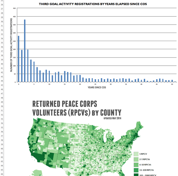
Oh — as a quick disclaimer, none of the data in here is privy — I’ve scrubbed this particular dashboard and images of any sensitive or PII data
What we started with
So nothing special, but like many offices, we started with dozens of disparate spreadsheets. Even trying to compile these into one spreadsheet would have been a non-trivial task (indeed, it was).
Organization of the dashboard

This Excel spreadsheet is made up of seven (7) tabs that work together in concert to create the entire ‘3GL Dashboard’.
The different tabs are intended to provide a walkthrough and instructions for the dashboard. There is a single tab devoted to just this type of information—a walkthrough for the various features of the dashboard itself.
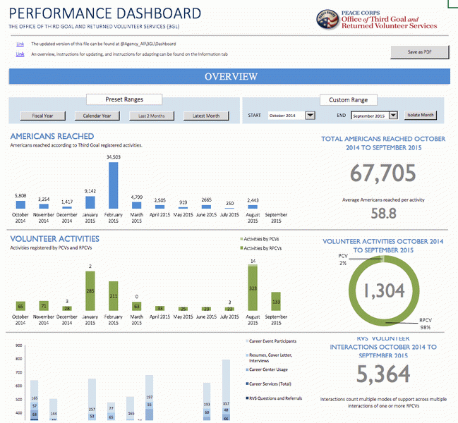
Dashboard
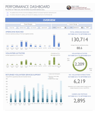
This is the main presentation component of the file. This tab contains the final numbers, graphs, charts, and interactive tools to provide an engaging and useable experience for the viewer.
By separating out the data and calculation steps (what one often sees in Excel…), we can ensure that this tab remains user-friendly and helps the intended audience find what they need quickly, without forcing them to navigate through tables of data and less relevant chart data.
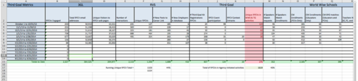
Datasheet
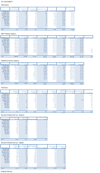
The datasheet is the meat of the document where data is concerned. We have made the decision in 3GL to make this document entirely monthly-focused.
This way we are not completely inundated with records from other tracking sheets. This is something that can be adapted for other offices and uses–but for us in this sheet, it works well to make comparisons.
An important note about the datasheet tables is that each one is a “table” as far as Excel concerned–it’s not simply a range of rows and columns.
What’s the difference? Well, sometimes not much. In this case though, it does affect things.
One nice thing about tables is that Excel gives them a fun little syntax as opposed to the cell reference. I can chat more about this later - but just recognize that it’s a good thing and makes our lives easier when trying to parse apart any calculations.
Definitions
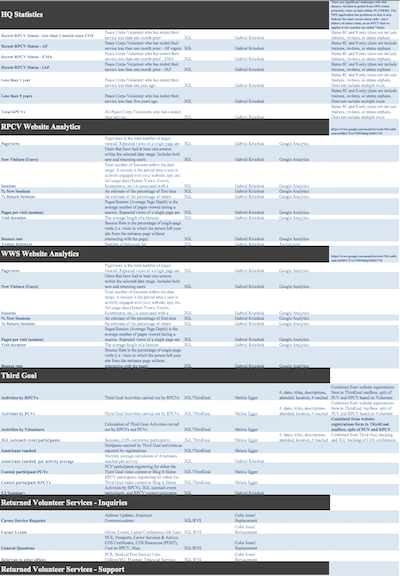
This tab became a necessity when we realized that we were consolidating some data categories, creating new ones, and sometimes disagreeing on how to sort items out.
This is much more helpful from a policy and planning perspective as it outlines the background of the items and de-clutters the presentation layer (dashboard) at the same time.
Also, this allows us to pinpoint office leads and responsible folks.
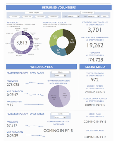
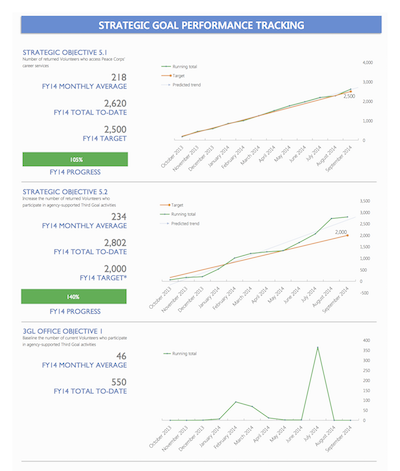
Performance
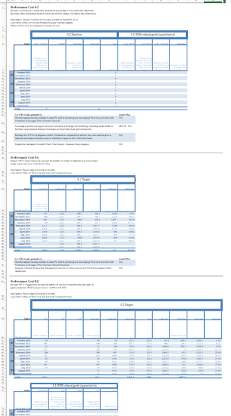
This tab is simply a more sophisticated datasheet for Peace Corps Strategic Objectives. You can see here how there are many more calculated values on the tables, and a requirement for more details on particular items themselves.
Charts
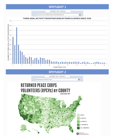
This is one of the more ingenious pieces of the file, if I do say so. Basically this tab works as a repository for the Spotlights portions of the dashboard.
Items (pictures, formulae, text) can be put into the appropriate chart are and then displayed on the spotlight by selecting it in the pull-down menu. Don’t forget to adjust the calculations page when doing this!
Calculations
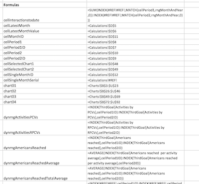
The backend of the whole page. Technically this is split up into two things as well. The first section are actual calculations that are being made. They exist here both to help with the buttons for the custom ranges as well as to help with some of the pie charts, which even though calculated have to have their numbers next to each other.
The second piece is a simply copy-paste of all the named ranges that are used in this document (all tabs in the dashboard). Most of the formulae and charts and things use the items in the named ranges in order to simplify both troubleshooting as well as transparency.
Footnotes
-
I mean, in theory. It sounds good, right? ↩